Spring colors for interior spaces can change the mood of your entire home, and if you’re thinking about interior house painting in Clarence, NY, now’s the perfect time. After a cold and gray winter, something is exciting about picking a fresh color and seeing your walls come to life. Whether you’re brightening up the living room or giving the dining area some charm, the right shades can shift the entire feel of your space.
As professional interior house painters in Clarence, NY, we get many questions about what colors look best on spring walls this time of year. The good news? You don’t need to follow trends unthinkingly. Spring is about softness, light, and a touch of warmth.
Let’s walk through five timeless colors that make your interior feel lighter, cozier, and ready for more sunshine.
Key Takeaways
Why Spring Colors for Interior Rooms Make a Difference
Color has a funny way of affecting how we feel at home. Light, soft colors in spring make spaces feel open, clean, and calm. When the natural light stretches further into the day, those pale greens, creams, and yellows shine.
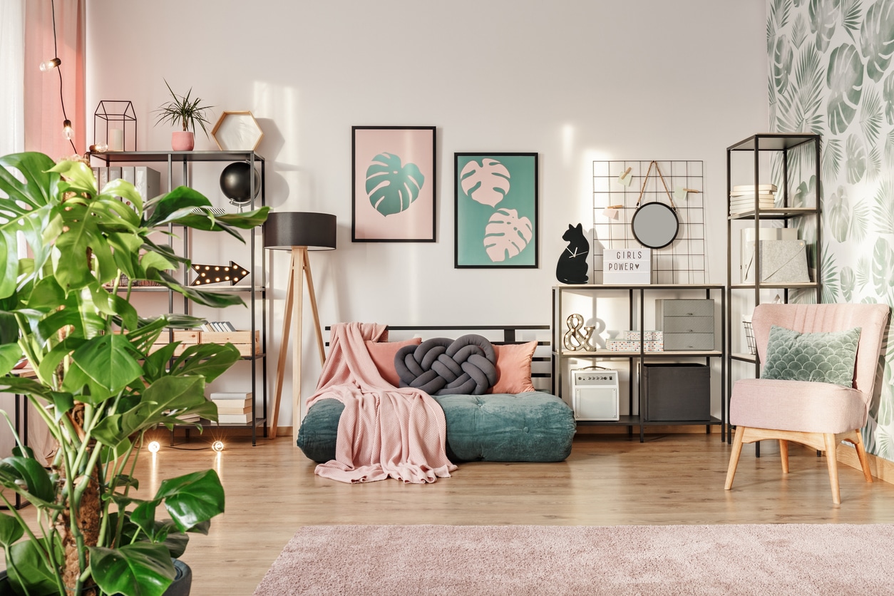
If you’re doing spring house painting, this is a smart time to look at your walls through a different lens. The gray that looked fine in winter might feel dull now. The beige you liked years ago might feel heavy. Luckily, you don’t need to do a total overhaul. Sometimes, just one room or accent wall is all it takes.
1. Fernwood Green 2145-40: A Nod to Nature
Ferwood green is a mossy green that brings subtle warmth that doesn’t overwhelm. It’s ideal for homeowners who want a pop of color without going bold. It is a calm backdrop with wood furniture, houseplants, and neutral rugs.
If you’re hiring an interior house painter for your family room or reading nook, this color is worth checking out. It has just enough depth to stand on while feeling relaxed and timeless. Pair it with ivory trim for a crisp finish.

2. Cappuccino 2096-50: Cozy with a Hint of Rose
This isn’t your average tan. Cappuccino 2096-50 brings warmth with a soft pink undertone that shows up beautifully in daylight and soft lamplight. It’s a perfect neutral for interior house painting that doesn’t feel cold.
Use it in a bedroom or hallway where you want a little comfort without the color stealing the spotlight. This shade also looks great with dark wood floors or off-white molding. This is a safe place to start if you’re unsure about committing to a bold spring shade.

3. Weston Flax HC-5: Just the Right Yellow
Some yellows can feel too lemony or bright, but Weston Flax is softer—like a wheat field in the sun. It adds a cheerful vibe without going full sunshine mode. This is one of those spring colors for interior spaces that feels custom, even though it’s been a favorite for years.
Try it in a kitchen or sitting room, especially if the space gets good natural light. Want it to feel fresh but not flashy? Use bright white trim or light gray accessories to balance it out.

4. Simply White OC-117: Clean, Warm, and Always Reliable
A white room doesn’t have to feel sterile. Simply White has a softness that works beautifully in spring. It pairs with any color scheme, and if you’re after a full room refresh, this color gives you a clean slate without feeling cold.
It’s especially great for interior house painting projects where you’re updating multiple surfaces—walls, trim, and even ceilings. If you’re unsure where to begin, this solid base plays well with just about any other spring color.

5. White Down OC-131: Easygoing and Creamy
This creamy off-white is a little warmer than Simply White. White Down is perfect for those who want a soft look without too much contrast. Whether you’re painting your living room or entryway, it creates a welcoming feel that’s hard to mess up.
One of our go-to tips for interior house painters is to use this color in multiple shades. Try matte on the walls and satin on the trim—it’s a simple way to add some depth without changing colors.

Choosing Spring Paint Colors That Work
You might be tempted to pick a color just because it’s trending. But let’s be real: not every shade of pink or green will look right in your home. Lighting, furniture, and layout all play a role. That’s why working with a professional interior house painter makes such a difference.
We bring sample swatches, discuss your vision, and help you pick something you won’t regret in three months. The best spring house painting jobs come from good taste and smart planning.

Let Advantage Paint Services Help You Bring These Colors to Life
If you’re thinking about a paint refresh and want it done right, we’re here to help. At Advantage Paint Services, we bring years of experience with interior house painting in Clarence, NY. Whether you want to go bold or keep it soft, we’ll walk you through the process with zero stress.
We proudly serve homeowners in Clarence, Amherst, Buffalo, and all the surrounding suburbs.
Call us today at 716-477-3966 for a FREE estimate, and let’s make your home feel like spring inside and out.


